arrowww Design & custom software development
New logo for Spacial. Two rejected versions
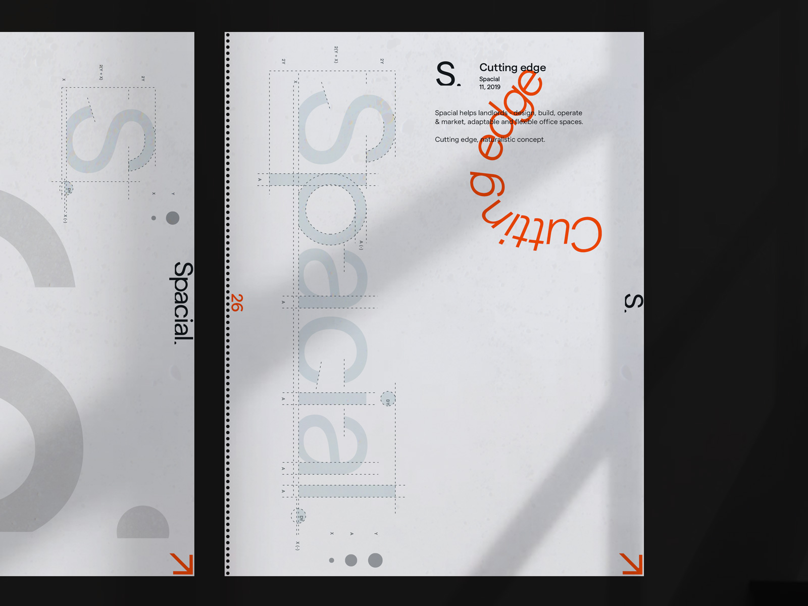
Spacial helps landlords - design, build, operate & market, adaptable and flexible office spaces.
Cssfox v7. Rebranding
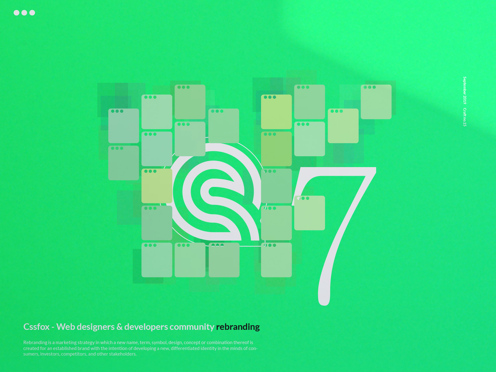
Cssfox community is a place to showcase websites, receive web design awards, find an inspiration for a web design project, learn web design from the greats and interact with people that have similar interests.
Yonatans v4. Website
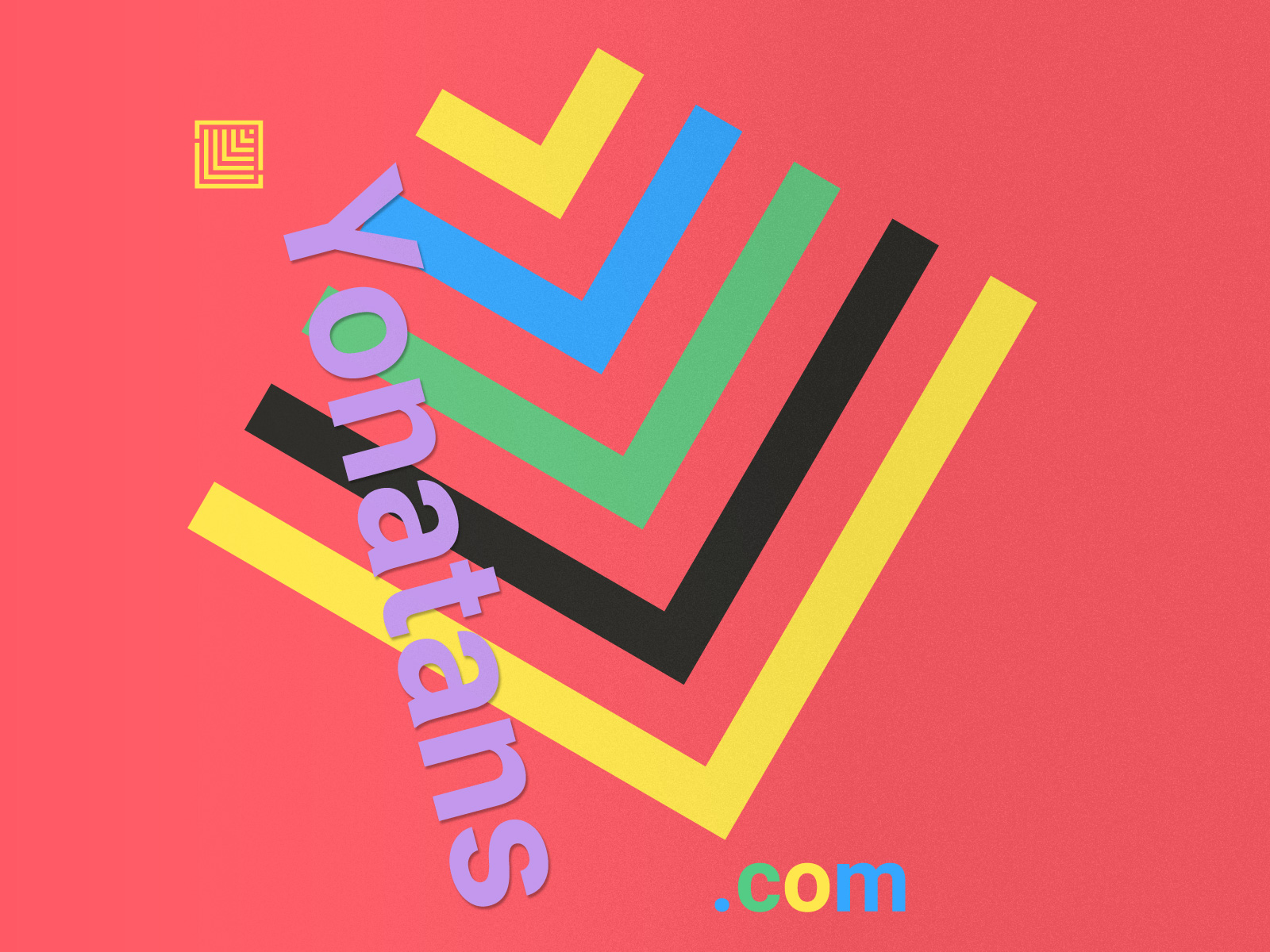
Yonatan a perfect baby boy was born with a diagnosis of Trisomy 21 (Up) Syndrome. Just like any child who is born to this world or maybe a bit more than a regular child, he filled his family's life with the greatest joy and laughter, but unlike a regular child, he is dealing with certain challenges, difficulties and delays.
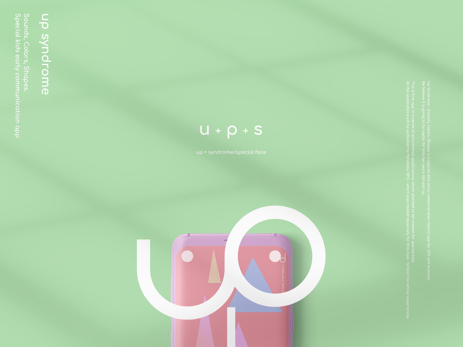
Up Syndrome. Special kids early communication app. V3
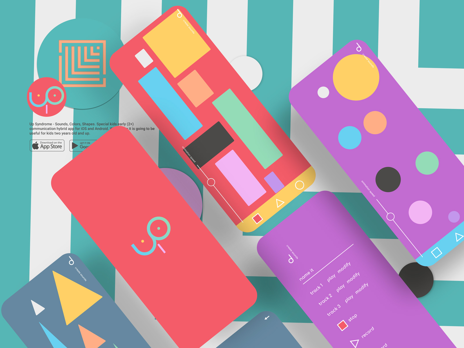
Up Syndrome - Sounds, Colors, Shapes. Special kid's early communication hybrid app for iOS and Android. We believe it is going to be useful for kids two years old and up. This is first app in a series of educational applications, which planned to be created for special kids. All the applications will be published by Yonatans NPO – which was created especially for this case - to host the similar experiences.
Michael Bublé Monogram and custom Oculus Go skin
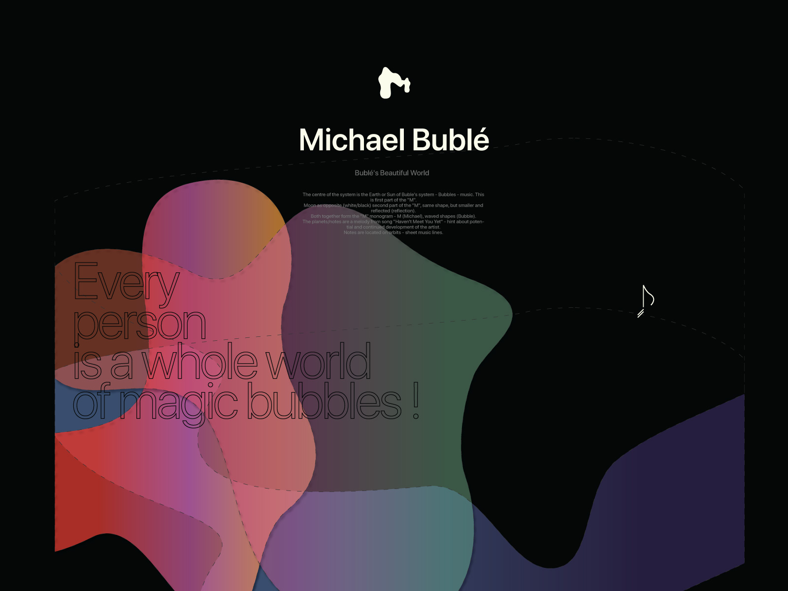
Every person is a whole world of magic bubbles.
Yousend — More anonymity, less hassle way to transfer money. V2
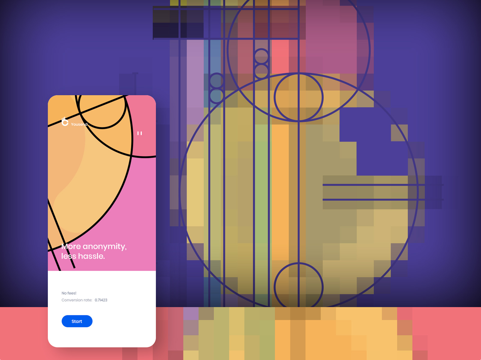
The purpose of Yousend mobile app is to let people tool to transfer money with maximum possible simplicity and anonymity.
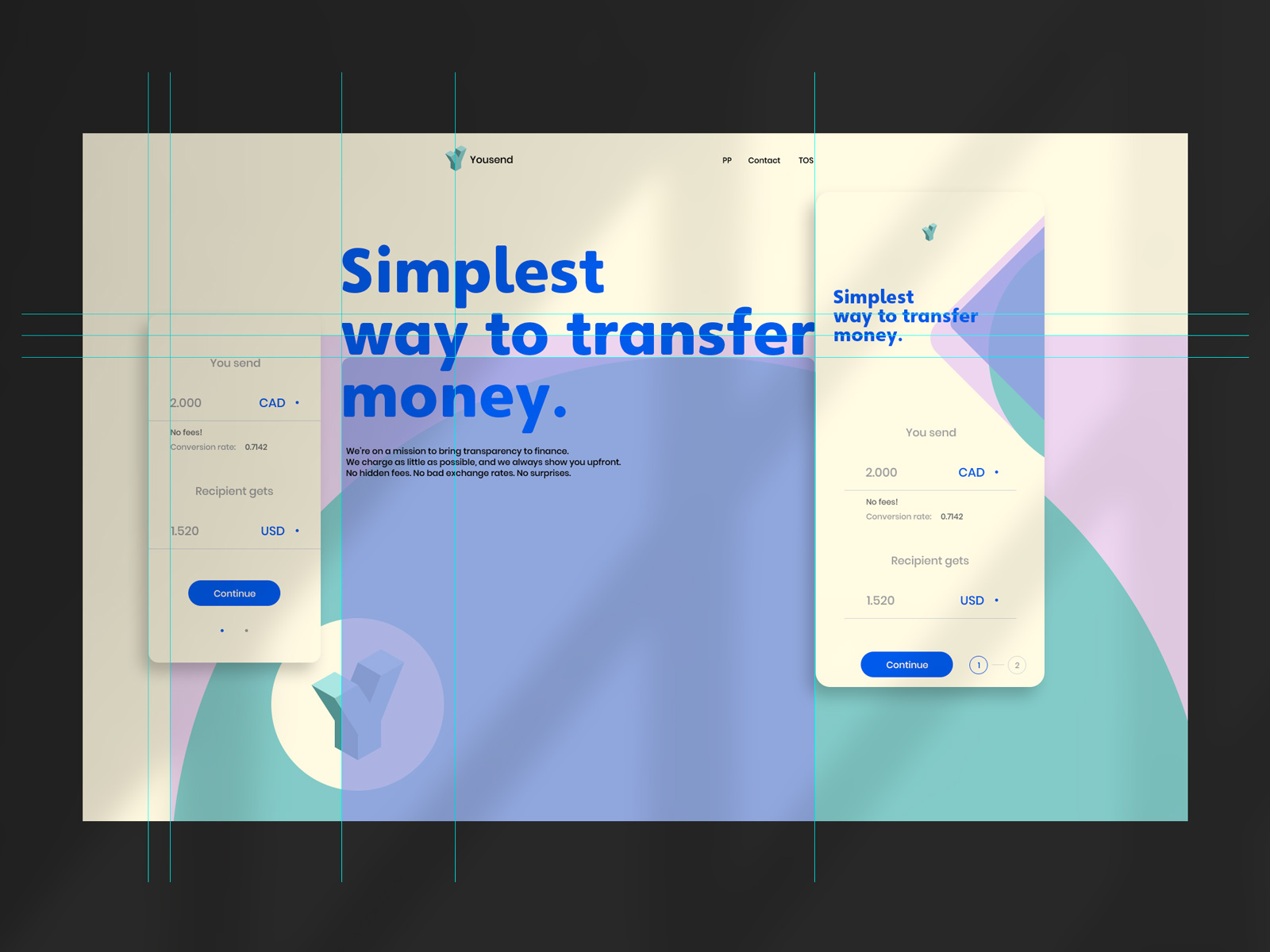
Yousend. First complete sketch
Yonatans v3. Website
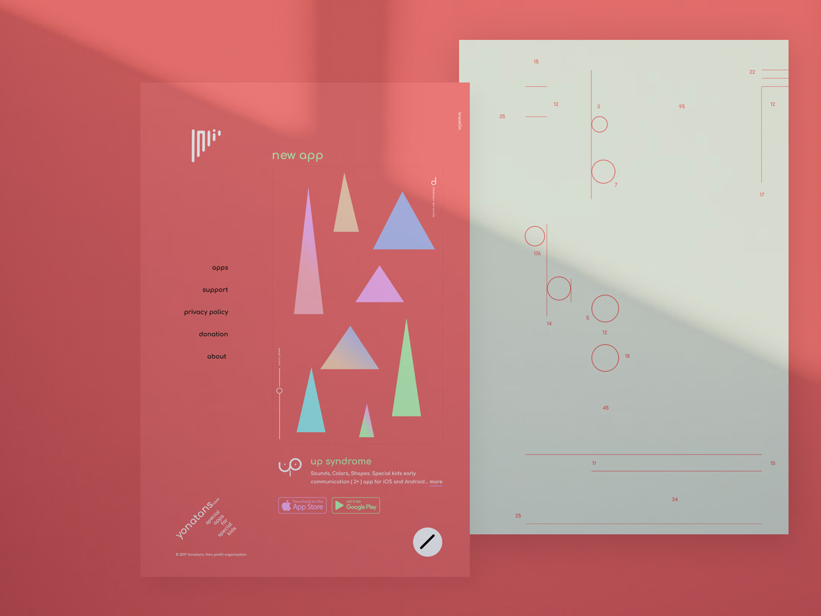
Yonatan a perfect baby boy was born with a diagnosis of Trisomy 21 (Up) Syndrome. Just like any child who is born to this world or maybe a bit more than a regular child, he filled his family's life with the greatest joy and laughter, but unlike a regular child, he is dealing with certain challenges, difficulties and delays.
brandOn v14. Main principles
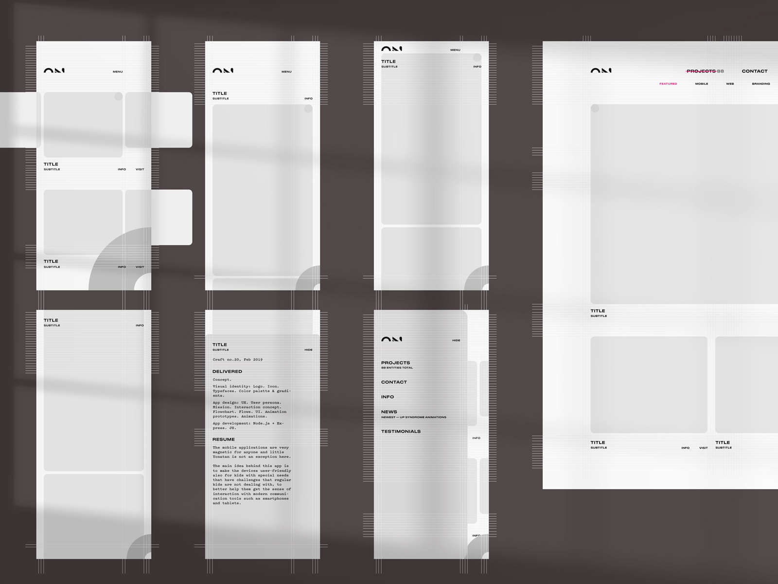
The work outlines basic principles which will guide the future redesign process of the brandOn materials.
Up Syndrome. Hybrid app v2
The mobile applications are very magnetic for anyone and little Yonatan is not an exception here. The main idea behind this app is to make the devices user-friendly also for kids with special needs that have challenges that regular kids are not dealing with, to better help them get the sense of interaction with modern communication tools such as smartphones and tablets.
Yonatans v2. Website, branding, ideas for future development
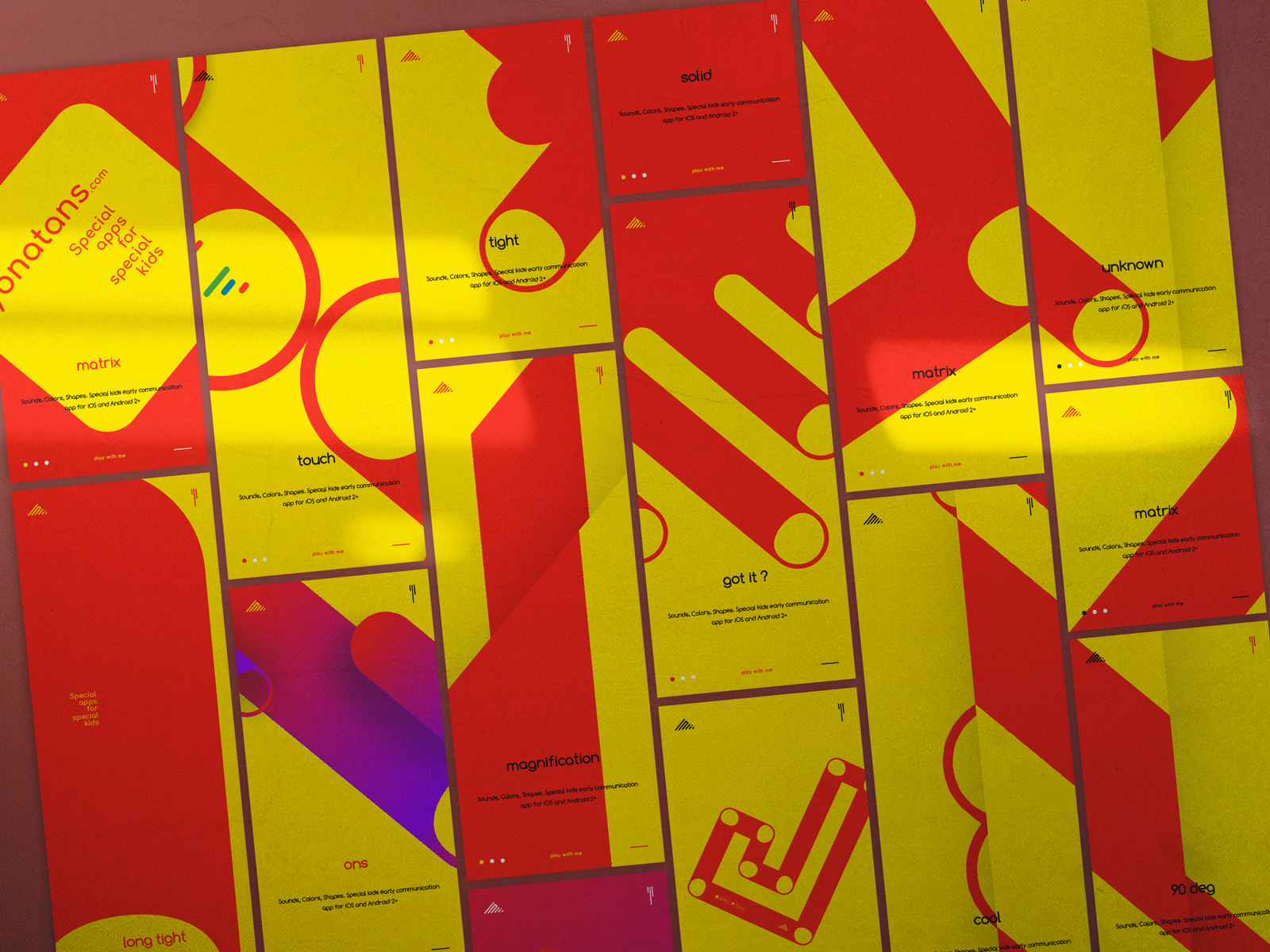
One of the differences between the art and design is that the art does not need to be updated, it is as good as it is, same thing if the design is out-dated it will reflect on how the product is sold. One of the possible reasons (noting for myself :) is that the art proposal is for a small group of people that are elite and require from its user some preparations, same time the design is selling for as many as possible users and here you need to make sure users will get it right away, in other words; message must be delivered immediately, otherwise you will lose the user for ever.
Up Syndrome. Hybrid app v2
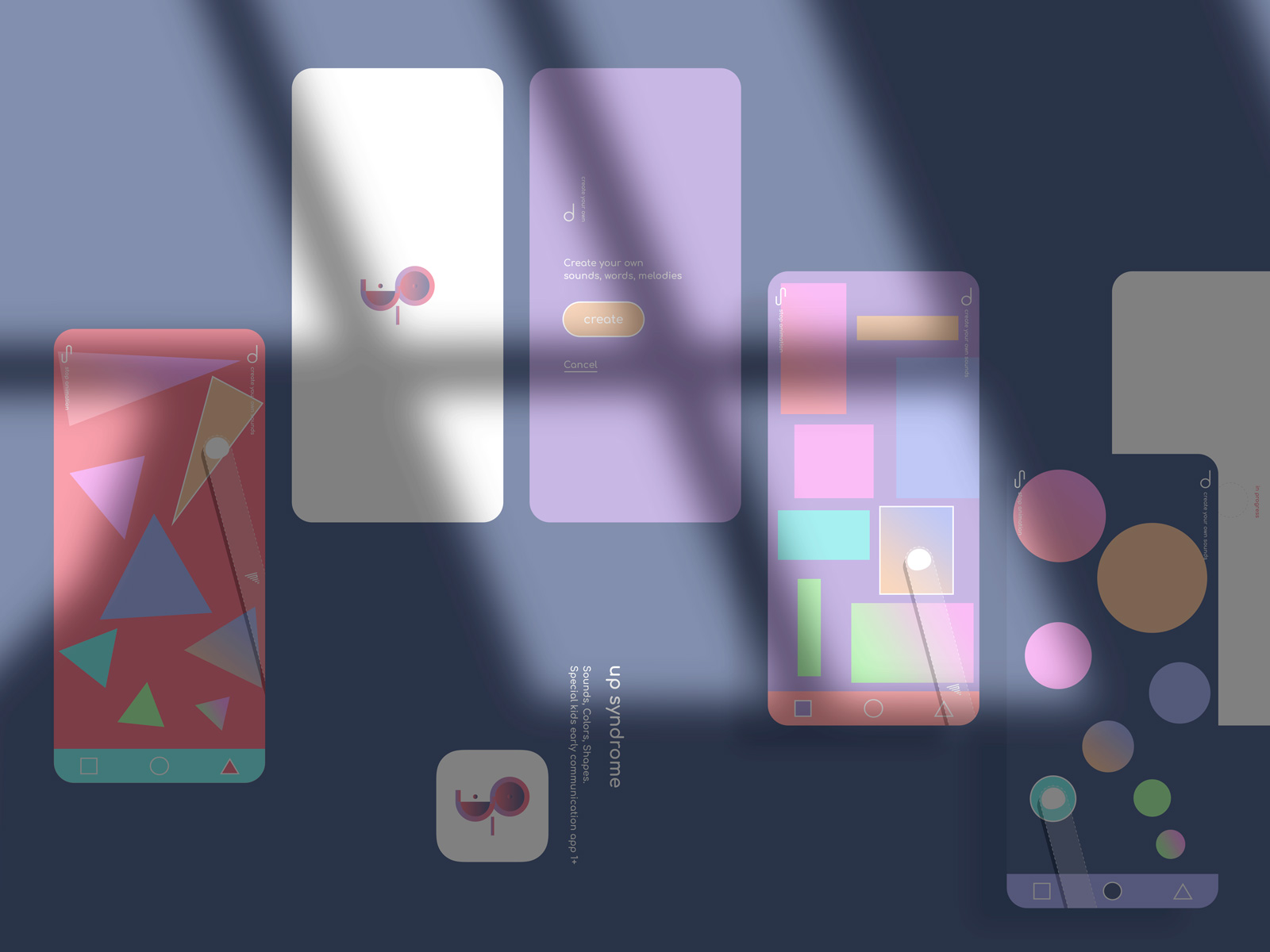
The mobile applications are very magnetic for anyone and little Yonatan is not an exception here. The main idea behind this app is to make the devices user-friendly also for kids with special needs that have challenges that regular kids are not dealing with, to better help them get the sense of interaction with modern communication tools such as smartphones and tablets.
Yonatans. Website
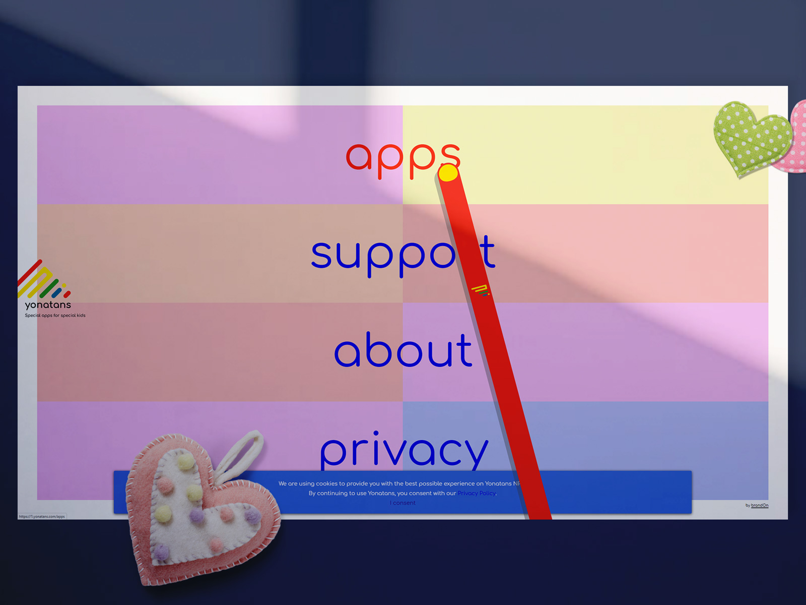
Just like any child he love devices to watch cartoons and to interact with mobiles but unlike a regular child, he is having difficulties to easily use the screen because of complexity of most of the apps, and even with watching a cartoon on a mobile, he can press the interface button and lose the point to continue watching and enjoying.
Up Syndrome. Hybrid app v1
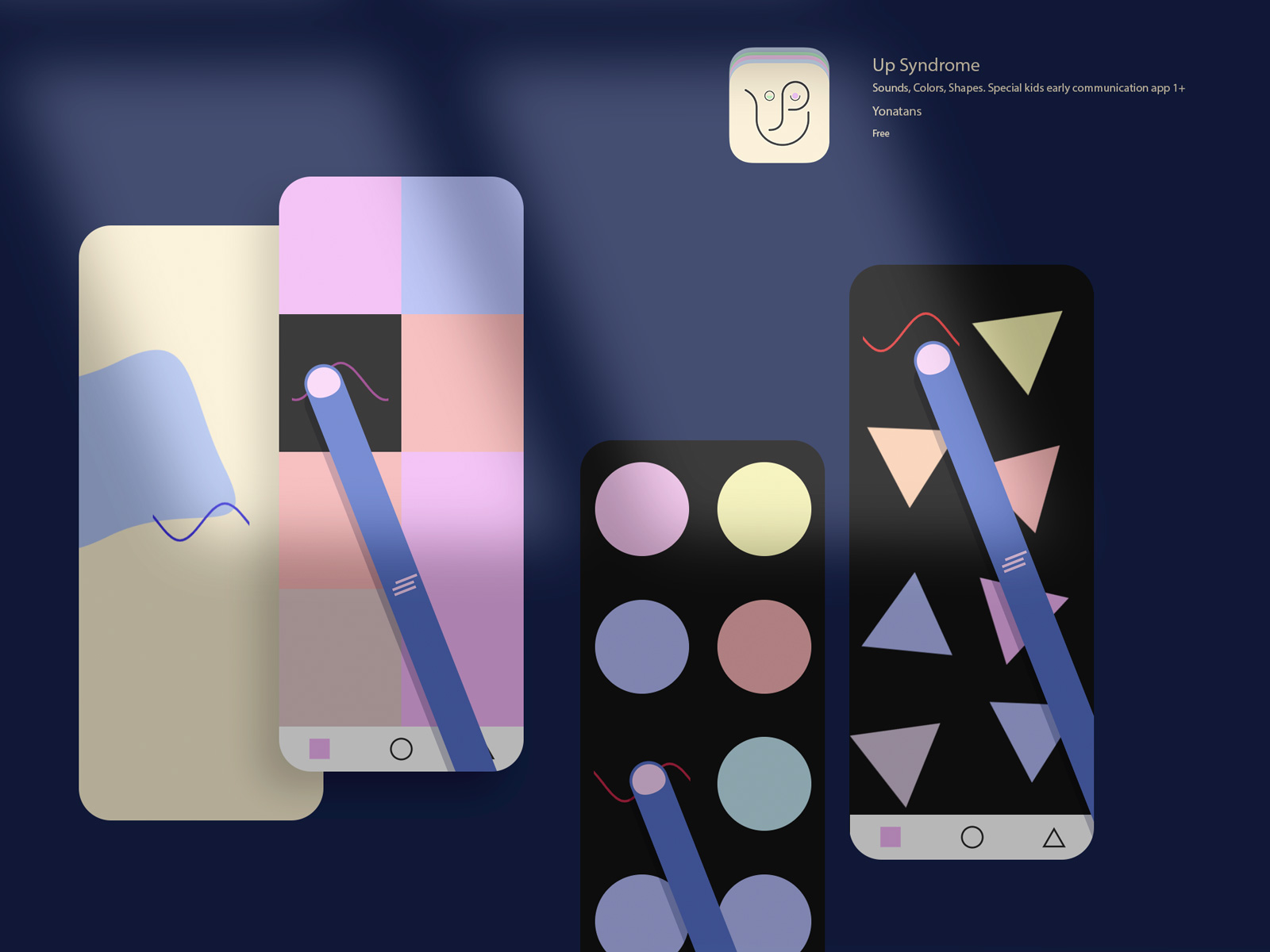
Up Syndrome (Sounds, Colors, and Shapes) is a special kid’s early communication hybrid app for iOS and Android. We believe it is going to be useful for kids two year old and up. This is first app in a series of educational applications, which planned to be created for special kids.
brandOn UX-first. WebTalkTo v13
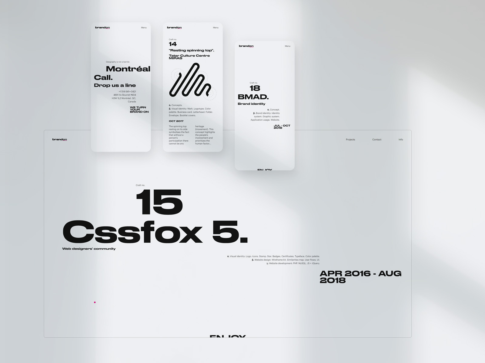
Application rule for the main decoration object - the line. The line should be applied on the right side of the parent object, visual reference to the heart, from point of view of someone who is looking at it. On & on. In other words - nonstop. If you want your business growing successfully, you need to be ready to work hard – nonstop, on & on.